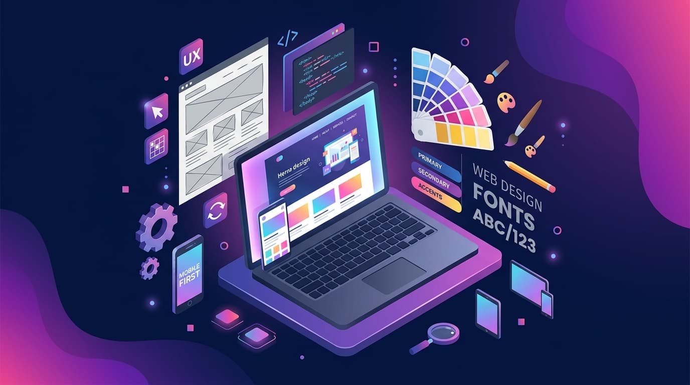
Introduction: India Browses on Mobile — Is Your Website Ready?
Take a moment to think about how your own customers find you online. They're probably not sitting at a desk. They're on a bus in Thane, waiting at a hospital in Andheri, or browsing during a lunch break in a Pune office. They're on their phones — and they're making purchasing decisions in those micro-moments.
India is, without question, a mobile-first country. Not by policy or design preference, but by reality. And yet, a staggering number of Indian business websites are still designed for desktop users — tested on laptops, approved by committees who look at mockups on large screens, and then released into a world where 70–75% of visitors will experience them on a 6-inch screen with one thumb.
This guide explains what mobile-first design actually means (it's not what most people think), why it matters enormously for both your customers and your Google rankings, and what specific features every Indian business website must have in 2026.
The Mobile Reality in India: The Numbers Tell the Story
Let's start with the data, because it's genuinely staggering:
- 750 million+ smartphone users in India as of 2025, making India the world's second-largest smartphone market
- 70–75% of all web traffic in India originates from mobile devices (IAMAI and Statista data)
- 95%+ of new internet users who come online in India do so primarily via smartphone — many have never owned a desktop computer
- UPI transactions: Over 14 billion per month — the vast majority initiated on mobile — show just how comfortable Indian users are transacting on their phones
- Average daily screen time on mobile: 4.9 hours in India, one of the highest in the world
For a business in Mumbai, Bengaluru, or even a mid-size city like Nagpur or Surat, the numbers locally mirror these national averages. Your website visitors are overwhelmingly mobile users.
Now consider: if your website wasn't designed with mobile as the primary consideration, you are actively delivering a poor experience to 7 out of every 10 visitors.
Mobile-First vs. Mobile-Responsive: Understanding the Crucial Difference
This distinction is fundamental, and it's the point where most business owners (and even some web designers) get confused.
Mobile-Responsive Design (the old approach)
A responsive website is designed for desktop first and then adapted to work on mobile. The layout reshuffles — a three-column desktop layout becomes a single column on mobile, the navigation collapses into a hamburger menu, text resizes. The website technically "works" on mobile.
But here's the problem: the underlying assumptions — the layout priorities, the content hierarchy, the image sizes, the interaction patterns — were all made with a desktop user in mind. Mobile is treated as an afterthought. The result is a website that functions on mobile but isn't genuinely built for it.
Common symptoms of a responsive-but-not-mobile-first site:
- Text is small and requires pinching to read
- Buttons and links are close together and hard to tap accurately
- The hero section is dominated by a large image designed to impress on a desktop monitor, but it pushes the key message below the fold on mobile
- Forms have too many fields that are frustrating to fill on a touchscreen
- The desktop navigation structure is preserved but hidden behind a hamburger menu, with no mobile-native navigation patterns
Mobile-First Design (the modern approach)
Mobile-first design flips the process. The designer starts with the smallest screen — typically a 375px wide iPhone or Android viewport — and asks: what does this user need, what do they see first, and how do they interact? Understanding the full UI/UX design process helps ensure your mobile-first site is built on research and user insights, not assumptions. The desktop version is then designed as an enhancement of the mobile experience.
This changes everything:
- Content is ruthlessly prioritised (you can't fit everything on a mobile screen, so you decide what matters most)
- Touch targets are large enough to tap comfortably (minimum 44x44px)
- Typography is immediately readable without zooming
- The primary CTA is visible without scrolling
- Load performance is considered from the start, not bolted on at the end
Why Desktop-Designed Websites Fail Indian Mobile Users Specifically
Indian mobile users have specific characteristics that compound the problems of non-mobile-first design:
1. Variable network speeds
Unlike in Europe or North America where 5G is increasingly standard, Indian users frequently switch between 5G, 4G, 3G, and even 2G within a single hour — especially when commuting or in crowded areas. A website with a 15MB background video that loads fine on a Mumbai fibre connection will completely fail for the same user when they step into a crowded local train.
2. Budget Android devices
The top-selling smartphones in India are budget Android devices (Redmi, Realme, Oppo, Vivo) priced between ₹8,000–₹20,000. These devices have significantly less processing power than flagship iPhones or Samsung Galaxy S series. JavaScript-heavy websites that rely on complex animations and large client-side rendering can feel sluggish or freeze on these devices.
3. Thumb zones and single-handed use
Indian users — like most mobile users globally — primarily browse with one hand, using their thumb to navigate. The "thumb zone" (the area of the screen easily reached by a thumb without repositioning) is central-bottom on the screen. Navigation elements, key CTAs, and important content placed at the top of the screen or in corners require uncomfortable repositioning.
A well-designed mobile-first site places its most important interactive elements within the thumb zone.
4. Small tap targets causing mis-taps
If your navigation links, buttons, and phone numbers are close together and small, users will tap the wrong thing repeatedly. This is frustrating, erodes trust, and often leads to abandonment — not because they didn't want to take action, but because the interface made it too difficult.
Google's Mobile-First Indexing: Your Rankings Depend on It
In 2019, Google began transitioning to mobile-first indexing — meaning Google predominantly uses the mobile version of your website to determine rankings for all searches, including desktop searches.
As of 2024, mobile-first indexing applies to essentially all websites. This means:
- If your mobile website is missing content that appears on your desktop site, Google doesn't consider that content for ranking purposes
- If your mobile experience is poor (slow, broken layout, unreadable text), your rankings suffer — even for users searching from a desktop
- The performance signals Google measures (Core Web Vitals) are measured on the mobile version of your site
This is a seismic shift that still hasn't fully registered with many Indian businesses. You might look at your website on your desktop computer and think it looks great — and you might be right. But if the mobile version of that same site is slow, cramped, or incomplete, you are ranking below where you should be for every search query.
Key Elements of a Mobile-First Indian Business Website in 2026
1. WhatsApp Integration (Non-Negotiable in India)
India has over 500 million WhatsApp users. For most Indian consumers, WhatsApp is their preferred communication channel for business enquiries — far more than email or contact forms.
A floating WhatsApp button that's always visible on mobile is not optional. It should:
- Appear in the bottom-right corner (prime thumb zone)
- Link directly to a pre-filled WhatsApp message ("Hi, I found you on your website and would like to enquire about...")
- Include your WhatsApp Business number (not just personal WhatsApp)
We've seen this single addition increase enquiry rates by 60–80% for service businesses with existing decent traffic.
2. Click-to-Call Phone Numbers
Every phone number on your website must be tappable. Use proper HTML: <a href="tel:+91XXXXXXXXXX">. An image of a phone number, or plain text that can't be tapped, is a conversion killer on mobile.
Place your phone number:
- In the header (visible on all pages)
- On every landing page, at least once above the fold
- In the footer
- On the Contact page
3. Fast-Loading, Optimised Images
As discussed in our Core Web Vitals guide, image optimisation is the single highest-impact performance improvement. On mobile, this is even more critical — users on cellular data pay for every MB downloaded.
Use WebP format, compress aggressively, and implement lazy loading for images below the fold.
4. Large, Well-Spaced Touch Targets
All buttons, links, and interactive elements should be at minimum 44x44px. Navigation menu items should have adequate padding. If a user has to tap three times to hit the right link, they'll leave.
5. Simplified Navigation
Desktop mega-menus are a disaster on mobile. Instead:
- Use a clean hamburger menu with large tap targets
- Limit primary navigation to 5–6 items maximum
- Consider a bottom navigation bar for sites with 4+ key sections
- Include a prominent "Contact" or "WhatsApp Us" in the mobile menu
6. Short, Scannable Content
Mobile users don't read — they scan. Structure your content for scanning:
- Short paragraphs (2–4 sentences maximum)
- Frequent subheadings
- Bullet points over dense text blocks
- Bold key information
7. Mobile-Optimised Forms
Every extra field in a form is a reason to abandon it. On mobile:
- Ask for only what's essential (Name, Phone, Brief Message)
- Use appropriate input types (
telfor phone,emailfor email — triggers the right keyboard) - Make labels visible (don't use placeholder-only labels that disappear when typing)
- Show a confirmation message after submission
Mobile E-Commerce: Why Indian Buyers Abandon Carts on Bad Mobile UX
India's e-commerce market is projected to reach $350 billion by 2030 — and the overwhelming majority of transactions happen on mobile. But cart abandonment rates on Indian mobile e-commerce remain alarmingly high, often 70%+.
The biggest reasons:
- Payment flow not optimised for mobile — small buttons, too many steps, no UPI option
- Product images don't load properly — grey boxes where product photos should be
- "Apply Coupon" field is broken — a surprisingly common issue that causes significant abandonment
- The checkout button is below the fold — on a small screen, the user doesn't see a clear way to proceed
- No guest checkout option — forcing account creation on mobile is a huge drop-off point
For any Indian e-commerce or service business with an online booking/payment flow, mobile UX testing should be done on multiple real devices — not just in a browser's developer tools mobile emulator.
Case Study: How a Coaching Institute in Dadar Transformed Their Mobile Presence
When a coaching institute in Dadar, Mumbai approached us, they had a beautifully designed website — on desktop. Their director had personally reviewed every page on his laptop and was proud of the design.
The reality: 78% of their website visitors were on mobile. And the mobile experience was a disaster. The font was too small to read, the enquiry form required scrolling through three screens before you could even see the submit button, and the homepage loaded in 9 seconds on a typical mobile connection.
What we rebuilt:
- Mobile-first layout with the course catalogue front-and-center on mobile
- WhatsApp enquiry button (floating, always visible)
- Click-to-call in the header
- Simplified 3-field enquiry form (Name, Phone, Course of Interest) vs. the original 9-field form
- Images compressed and converted to WebP
- New Lighthouse mobile performance score: 91 (up from 24)
Results after 4 months:
- Mobile bounce rate dropped from 74% to 41%
- Enquiry form submissions increased by 285%
- WhatsApp enquiries: averaging 80–90 per month (previously zero, as the number wasn't clickable)
- 12 new batch enrolments per month directly attributed to website leads
The difference wasn't a new design trend or a fancy feature. It was simply putting the mobile user first.
Questions to Ask Your Web Designer About Mobile-First
Before signing with any web agency for your new website, ask these questions:
- "Can you show me examples of your mobile designs specifically — not the desktop version?"
- "What is the mobile Lighthouse performance score of your last 3 projects?"
- "How do you test for mobile usability — on real devices or just browser emulation?"
- "Does the design include WhatsApp integration and click-to-call as standard?"
- "How do you handle touch target sizing and thumb zone optimisation?"
- "What is your approach to mobile page load speed?"
An agency that has mobile-first in their process will answer these questions confidently and specifically. An agency that doesn't will give vague answers about "responsive design."
Frequently Asked Questions
What does mobile-first website design mean?
Mobile-first design means designing your website for smartphone screens first, then scaling up to tablets and desktops. Instead of building a desktop site and shrinking it down, you start with the smallest screen and ensure the core experience — content hierarchy, navigation, CTAs, and performance — works perfectly on mobile before enhancing it for larger screens.
Why is mobile-first design important for Indian businesses?
Over 70% of web traffic in India comes from mobile devices, and most new internet users access the web exclusively through smartphones. Google also uses mobile-first indexing, meaning your mobile site determines your search rankings for all devices. A website that isn't designed for mobile first is losing the majority of its visitors and ranking potential.
How do I check if my website is mobile-friendly?
Use Google's PageSpeed Insights (pagespeed.web.dev) and check the Mobile tab for your performance score. Also test your site on a real smartphone — not just browser developer tools — by navigating, tapping buttons, and filling out forms with one thumb. If anything feels awkward or slow, your mobile experience needs improvement.
What is the cost of a mobile-first website in India?
A professionally designed mobile-first website in India typically costs ₹40,000–₹2,00,000 depending on complexity, number of pages, and features. Mobile-first design doesn't cost more than desktop-first design — it's simply a different approach. The investment pays for itself through better conversions, lower bounce rates, and improved Google rankings.
Conclusion: Mobile-First Isn't a Trend — It's the Only Way
In 2026, designing a website that treats mobile as an afterthought is like opening a shop that's only accessible by car in a city where most people walk. You might attract some customers, but you're excluding the majority — and that exclusion shows up directly in your enquiries, your sales, and your Google rankings.
Mobile-first design is not more expensive than desktop-first design. It's simply a different mindset and process. And when done well, it delivers dramatically better results for Indian businesses.
At KT Solutions, every website we design begins on a 375px canvas. Mobile-first is not a feature we offer — it's how we work. Talk to us about your website or explore our website design services to see our approach in action.